The look of Wafflerama
Wafflerama has been blessed with strong visual design. Here are the logos and images, past and present.
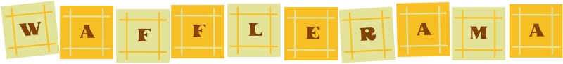
Origins
I created a lo-fi logo around the turn of the century. I wanted a design that would mimick the idea of the 1960s styling of the Cinerama logo in Seattle.


20th Celebrations designs
Designing wiz Paul Barron, who has done all the logo work for Wafflerama, helped me transform this into something more arresting for the 20th year celebrations. My draft idea was to adapt my blocks to a colour set and styling that suggested waffle grids.
Paul came up with a great font that feels like syrup is being poured into the letters. We painted large versions of the letters onto corrugated plastic for the sign that hung from the top of the Wafflerama float, and used the same palette for all the waffles we drew for the float exterior.

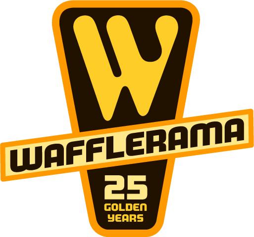
25th year celebrations
To mark 25 years since the start of Wafflerama, we decided to create t-shirts and aprons. The slogan was "25 golden years", and Paul modified the original design, changing the font to something stronger that really suggested syrup pouring into a letter, and pushing up the 'gold' colouring. We printed the full logo and text, as well as just the W, which is at the top of this page.
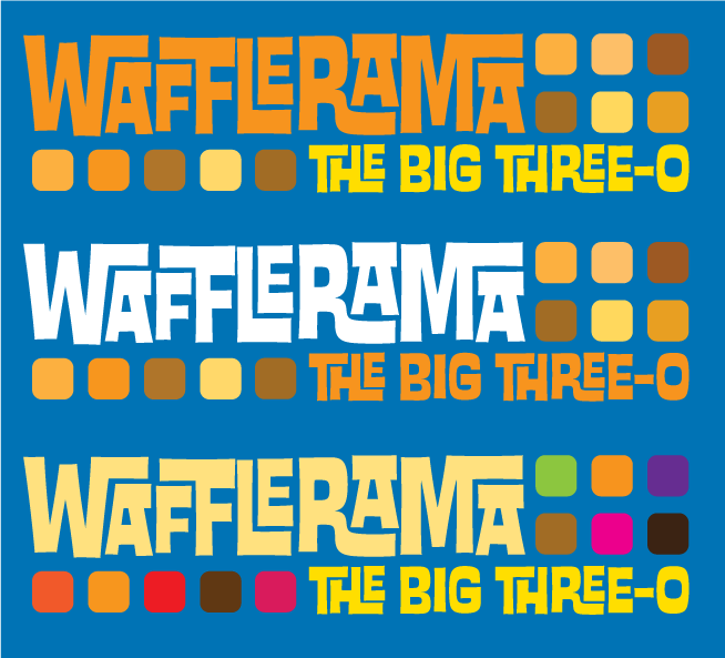
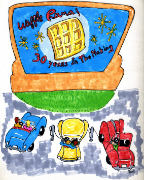
The Big Three Oh!
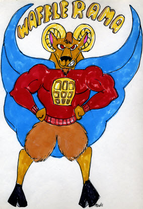
For 2012, to mark 30 years of Wafflerama, I put a call out to designers who had attended, asking if anyone had time to submit something to turn into a t-shirt or logo. I hit a "feast" phase in the feast-famine cycle, so most folks were pretty tied up, but a few came through.
Artist Michael Lewis submitted two drawings, one based on the "ram" pun in Wafflerama, the other melding the Wafflerama event with the lawn cinema event I throw in the summer time.
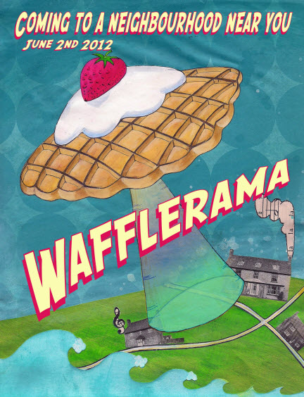
Originally, we also planned to enter a cycle-powered flying saucer waffle into the parade. That idea fell through, but Heather Johnston of Float Media came up with a great collage.
Finally, Paul Barron took some time out from a busy career in the world of finance to revisit the logo again, this time with a lovely set of colour patches that hint at the grids of the waffle. One of the three choices below will be on the Royal Blue shirt.